Collaborative Project
Desktop and mobile site redesign
Brief
Produce a body of research and designed artefacts which evaluate and make design recommendations for improvements to specific areas of the Virgin Wines website.
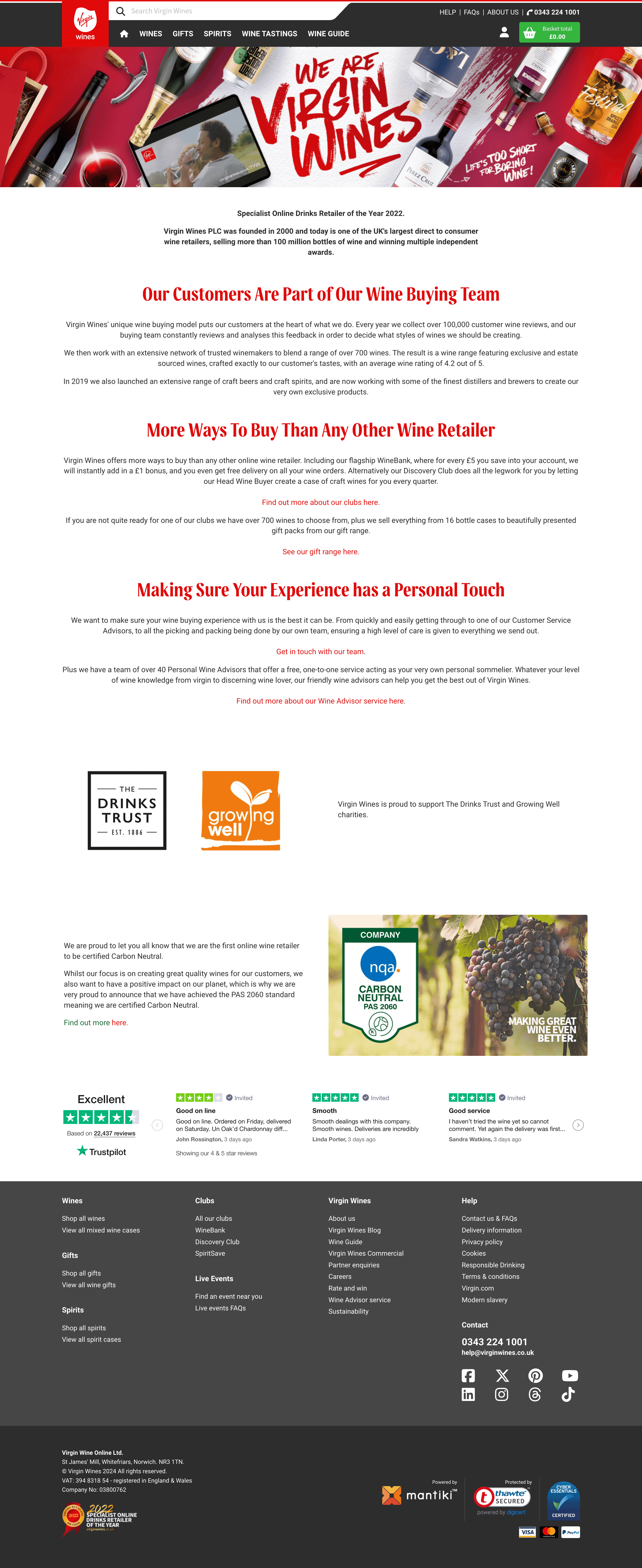
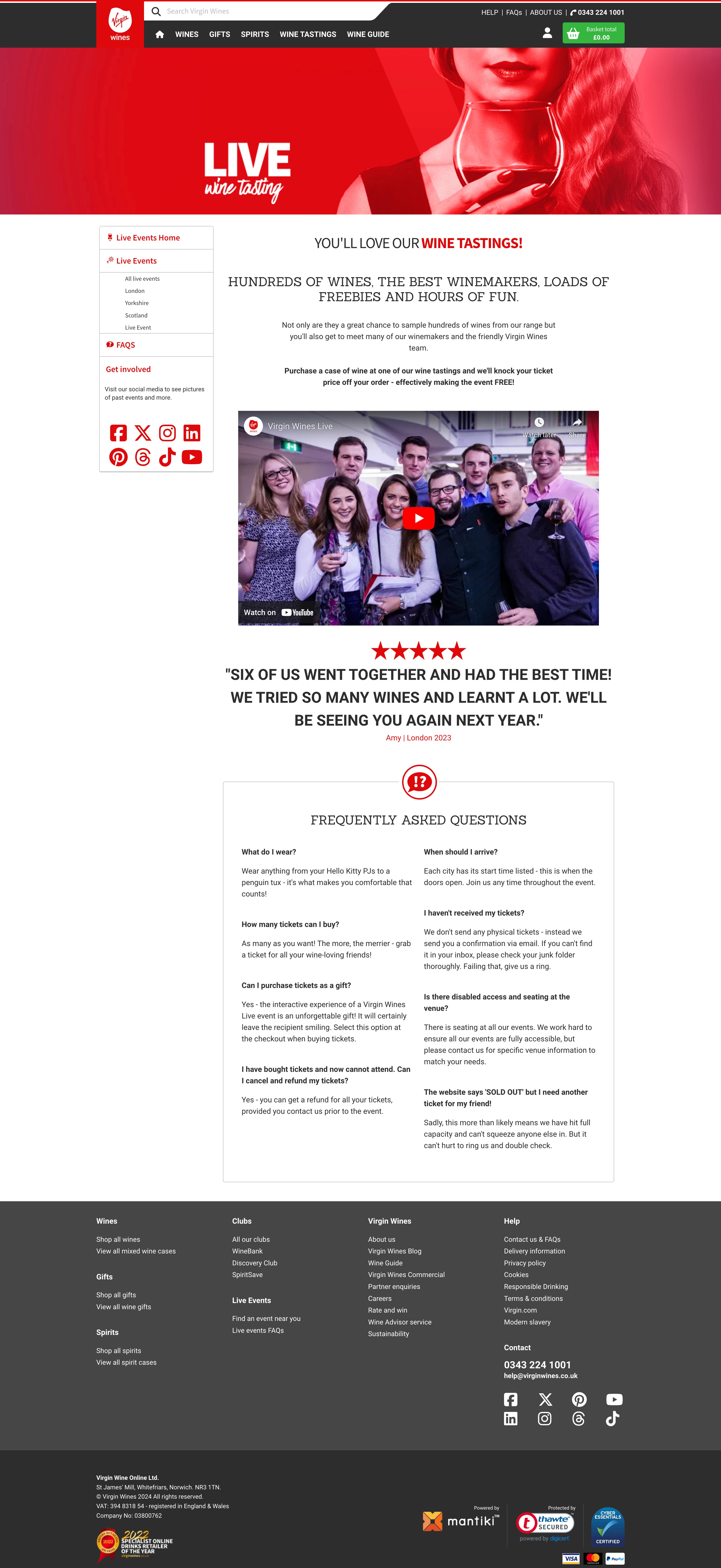
We were assigned in groups to redesign 3 pages from the VirginWines website
- About us
- Live events
- Checkout
Procedures
In order to get the final outcome, there are tasks need to be done to find out what improvements can be made to achieve best result that would satisfy users' need. However, we as a group decided to split some tasks or work together for one task so that we can share our opinion and merge our ideas.
As for my role, my task are improvise any design needed (optional), dynamic motion and prototyping the final result. To fulfill my part I would have to analyze the flaws of the site.
Heuristic Markups
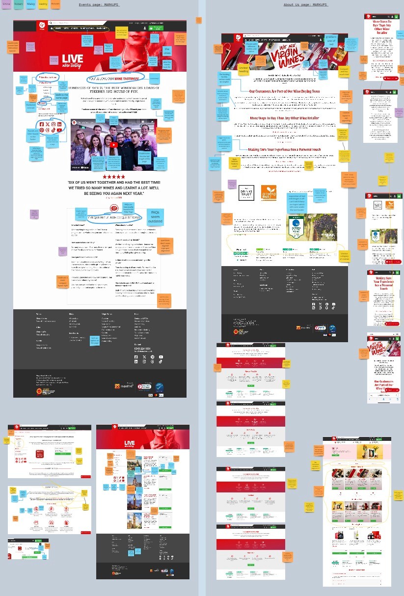
As a group we put up sticky notes and add our own remarks on the flaws of the page that causes the site to look unprofessional in terms of the design, unnecessary info and layouts
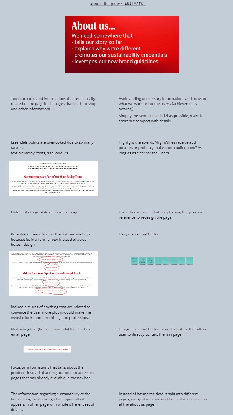
From the analysis, we summarize what we found that needs improvement from our point of view.
User Flows
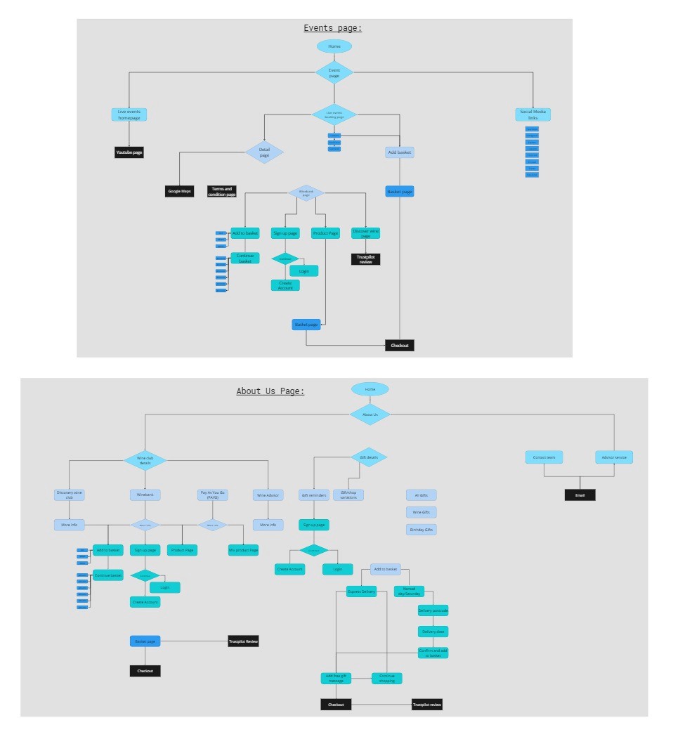
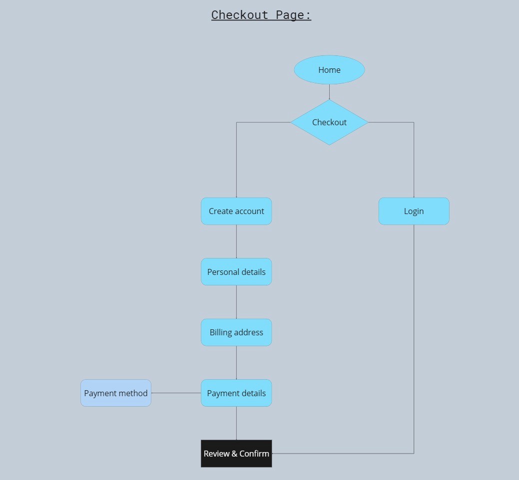
Studying the site, I realize the userflows are scattered and very messy, (aside from checkout, it seems pretty direct) even I myself got lost navigating it and there are some pages irrelevant to the headline of the page which I believe is much better if i get rid of it.
User Flows
Simplify the
User Inteviews
User interviews were conducted to see their opinions regarding VirginWines and to see if the site has been helpful for users. Learning what matters is crucial for us to improve the quality of the site.
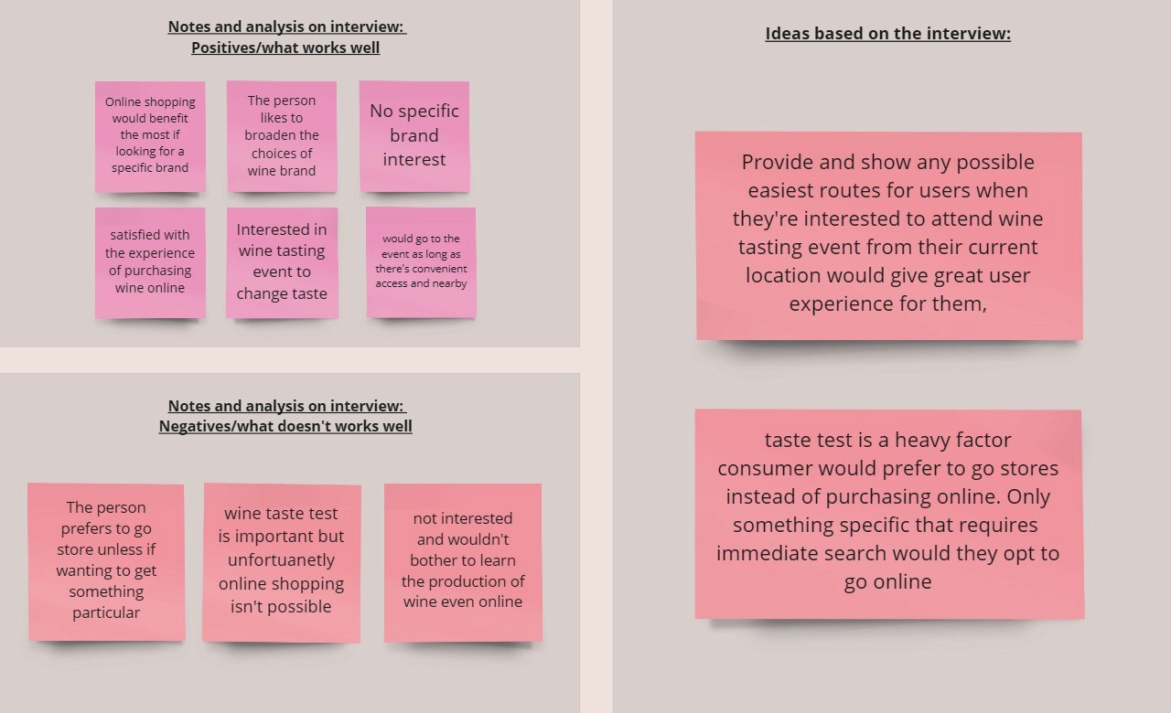
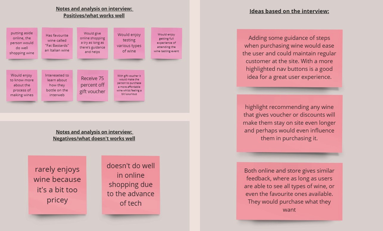
Both individual have different opinion but in terms of online, however we found certain reason to why users do not purchase wine online.
One of the reason was because they don't know how to use it and my idea to tackle this problem is by having more clear guideline on site that will help user to proceed next step.
Competitor Review
Purpose of competitor review is to understand how this product able to be successful and take inspiration from the site as well. Although they too have some flaws but the website itself still looks professional. Notes were jot down when analyzing so I can implement some useful elements from them into our final outcome.
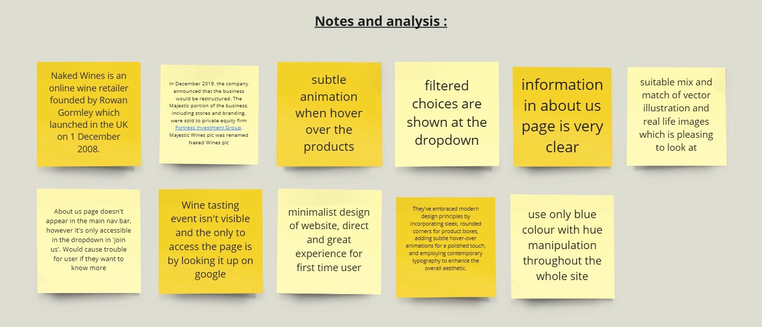
This particular page manage to capture my attention, I love how all bottles have a very subtle motion when hover over rather than being static. It's brilliant because it could make users stay in the page for a bit longer. This in fact proves even a slightest motion is important and it can actually give postive impact.
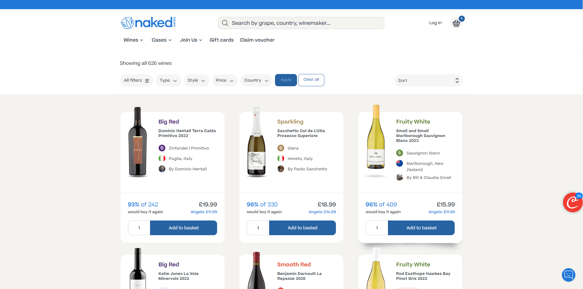
Our group Miroboard research
To summarize what we found :
1. Unclear headings on pages led to confusion
2. Lack of hierarchy made content hard to follow
3. Design lacked aesthetics and minimalism
4. No engaging design elements
Design ideation
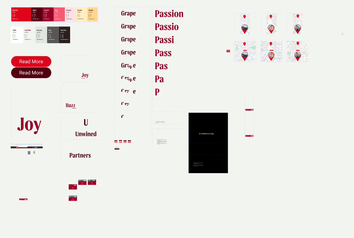
Most of our design reference are based on our competitors in terms of the website's interface. However, we kept VirginWines official colour scheme and typography since it's part of their brand identity.

Then each one of use will sketch the designated pages we were told to before we proceed on figma. It's important because it will help us to visualize how the end result of our site will look like.
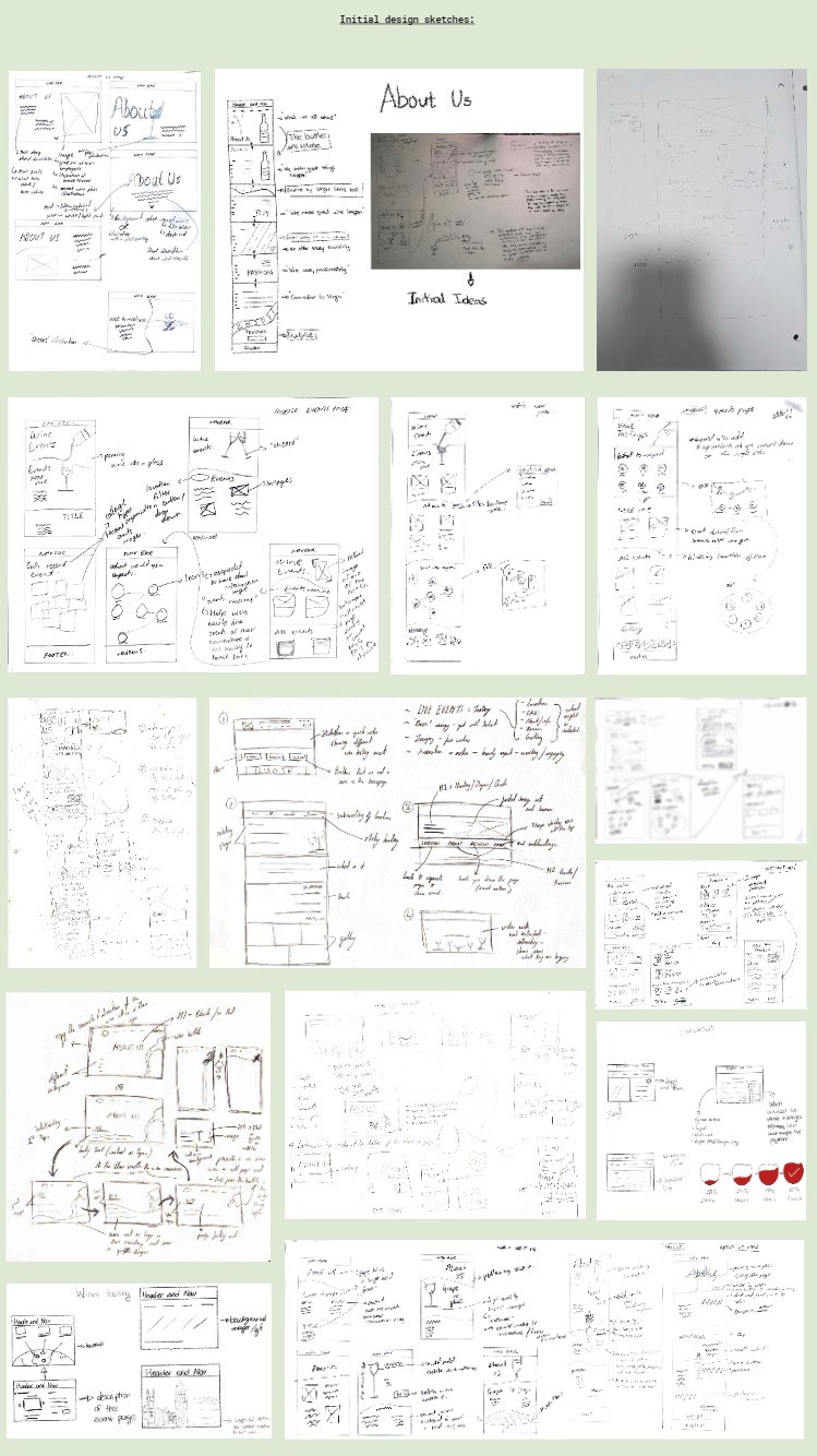
Desktop and Mobile redesign

About Us (desktop)
I animated all big words to make the page look more lively. Everytime the cursor enters a segment, the words will reveal. To make it more interesting, every words have their own unique animation and i try to relate the words with the animation.
For example, 7 circles at random spot enlarges with faded in animation to reveal the word grape
Circle = grape shape
Liquid pouring animtion then reveals the word joy.
Pouring drinks = excitement
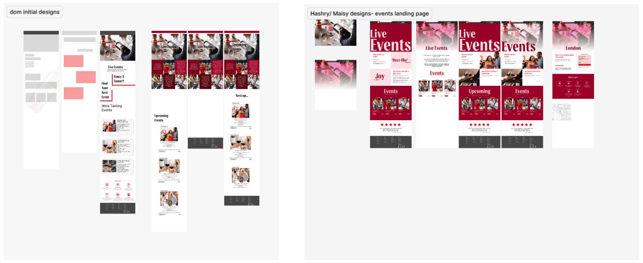
Wine events (desktop)
In the early stage of development, my groupmate made the initial design for the wine events page. I decided to improvise a certain section because it looks a bit unorganized.
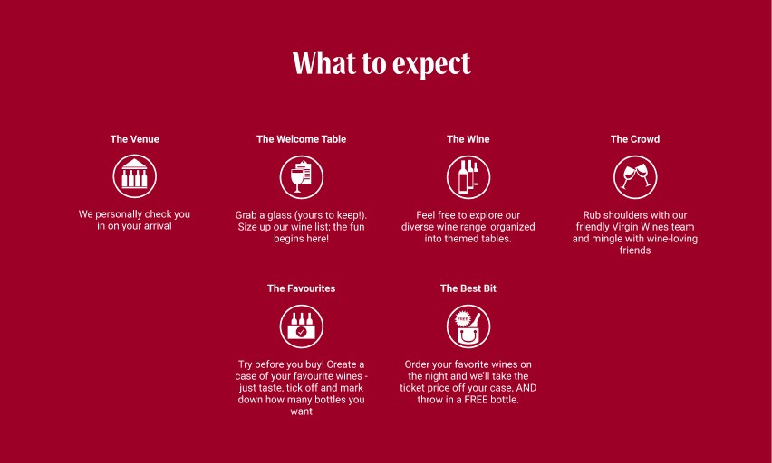
For "what to expect" bit, i made no changes because any additional design or information felt force. However, I add a very subtle motion when you hover over the icons. I get this idea from Naked Wines product page where they have their bottle moving when hover over.
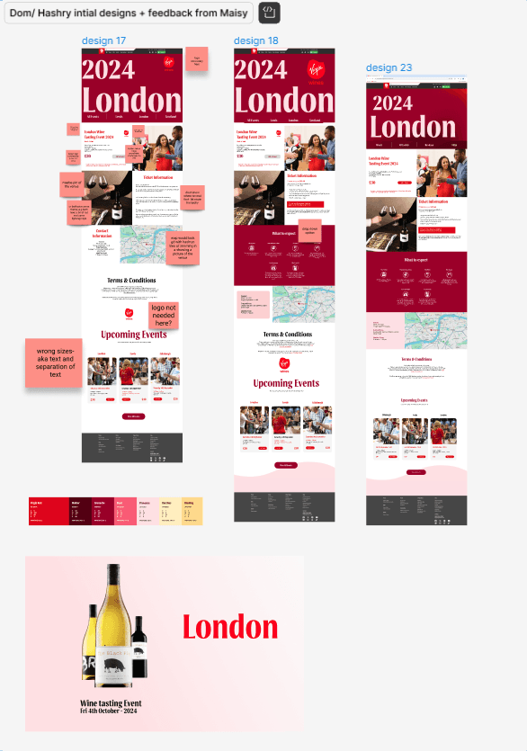
For the individual events page my groupmate and I made our own design and we decided to merge our ideas.
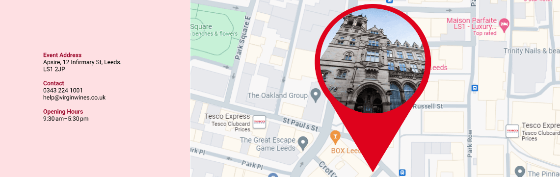
However, I did add an extra feature on the map.
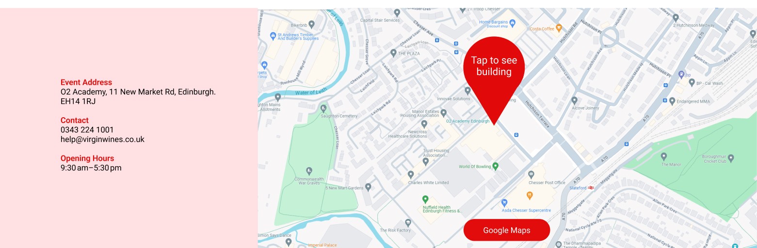
Tapping the pin will show users an image of the exact building of where the event will be held.
Wine Events (Mobile)
Similar to desktop, I redesign my groupmates initial design just by minimizing each segment of the page to make it shorter. I implement the map feature from the desktop as well for consistency.
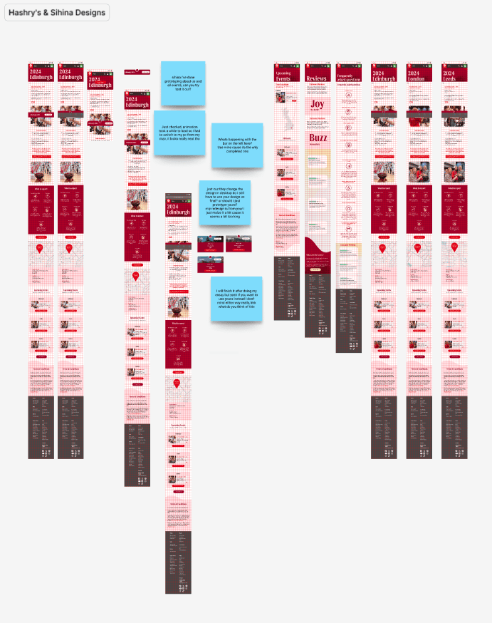
It's not possible to maintain the design of the feature in mobile because it has small screen. So, I added a hamburger icon menu that functions specifically for users to roam around within the wine events page.
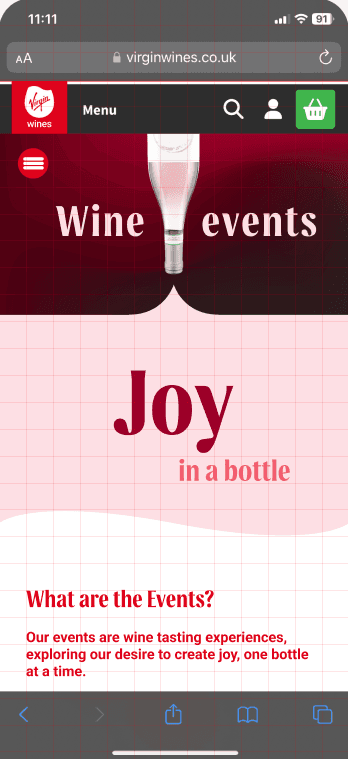
Side Navigation
Bar (Mobile)
On desktop, a new sub navigation was added within the wine events page that lets users to read reviews, FAQs about the event and individual events. We just add it below the original nav bar and make it stick together with it
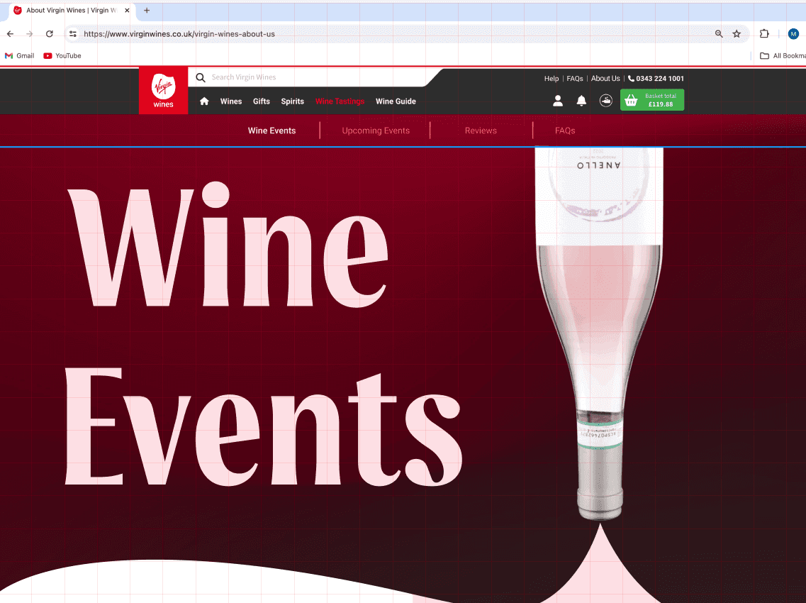
I retain the design of the bar similar with VirginWines menu bar because it only appear in this specific page, I reckon not to have any unique design on the menu
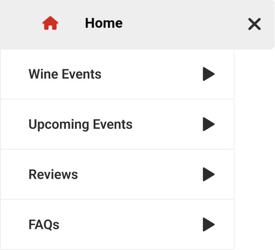
Dynamic Motion Text
All the components of motion were done by me, Grape and Passion took the longest time to animate because I would have to animate each character at a time. You may look at the functional prototype by clicking the button below.